Toyota
Costa Rica
Toyota
Costa Rica
Philips
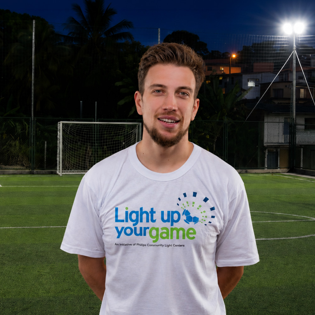
Light up your game
Transforming Sustainability Into a Story People Could Share
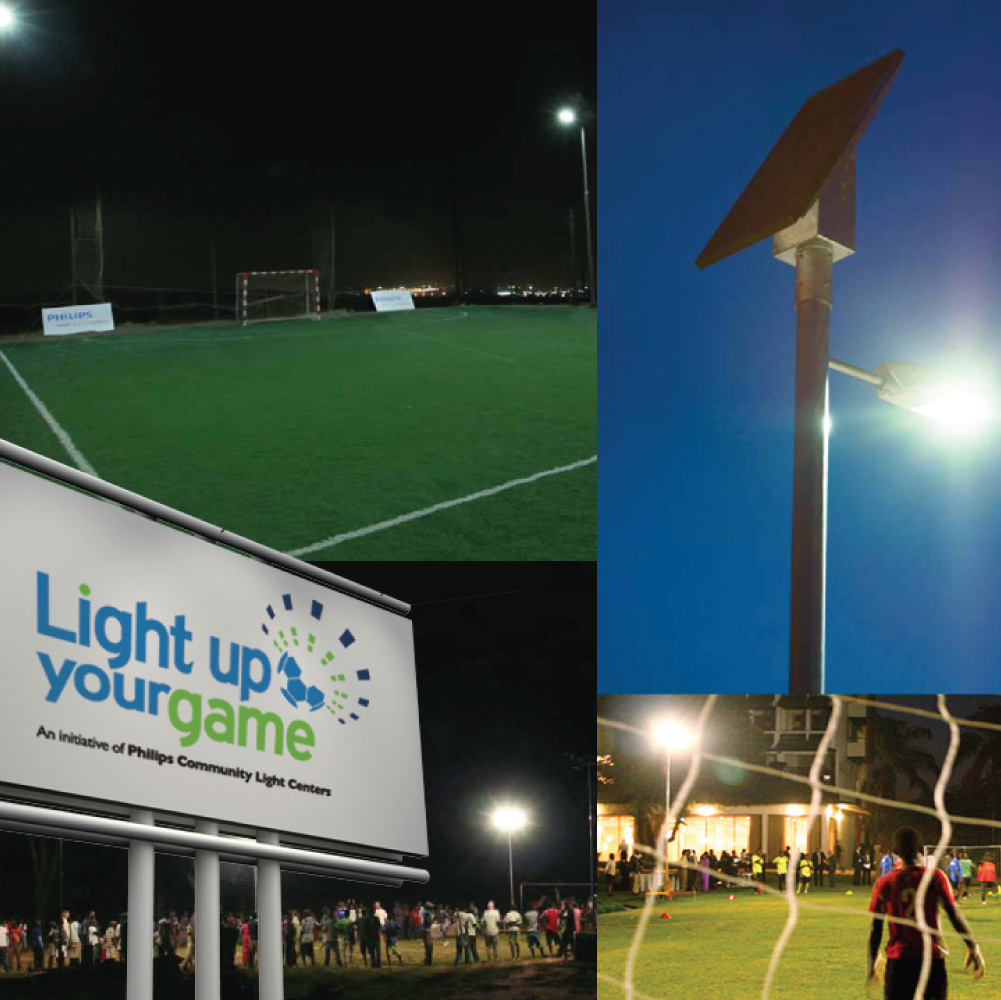
Philips wanted to bring its Community Light Centers initiative to life across Latin America through something deeply rooted in the region's culture: soccer. The idea was simple. By installing solar-powered lighting in community sports fields, Philips could create safer public spaces where people could gather, play, exercise, and stay active after dark. The challenge was making that story easy to understand across 10 countries, three languages, and multiple audiences.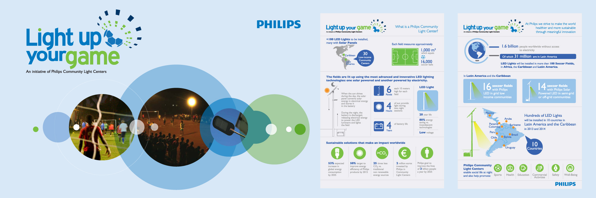
The goal wasn't simply to launch a campaign. It was to make a regional sustainability initiative easy to understand, easy to activate, and easy to share.
The Challenge
Communicating One Story Across an Entire Region
The campaign needed to connect with audiences that were very different from one another, including journalists, community leaders, local partners, Philips teams across Latin America, and the general public. At the same time, it had to explain a technically complex initiative involving solar energy, battery storage, and LED efficiency without becoming overly technical or losing clarity.
Because the campaign would rely heavily on earned media, every communication asset had to do more than look polished. It needed to be genuinely useful for journalists, making it easy to understand the initiative, adapt the information, and share the story across different markets and editorial formats.
The challenge wasn't only to design a campaign. It was to make a regional sustainability initiative easy to understand, easy to activate, and easy to share.
The Solution
One Idea. Three Languages. One Regional Identity.
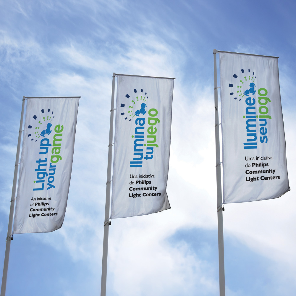
Everything began with a simple visual concept: A soccer ball becoming a burst of light. The identity was developed simultaneously in three languages:
Light Up Your Game (English) | Ilumina Tu Juego (Spanish) | Ilumine Seu Jogo (Portuguese)
Rather than translating one campaign into multiple languages, we created a regional identity designed to feel native in every market.
A regional campaign doesn't need three adaptations of one brand. It needs one idea strong enough to feel native in every language.
To ensure consistency across Latin America, we developed complete Brand Design Guidelines covering:
- Logo usage
- Color palette
- Typography
- Messaging
- Graphic applications
The campaign was then extended across multiple communication touchpoints, including:
- Infographics
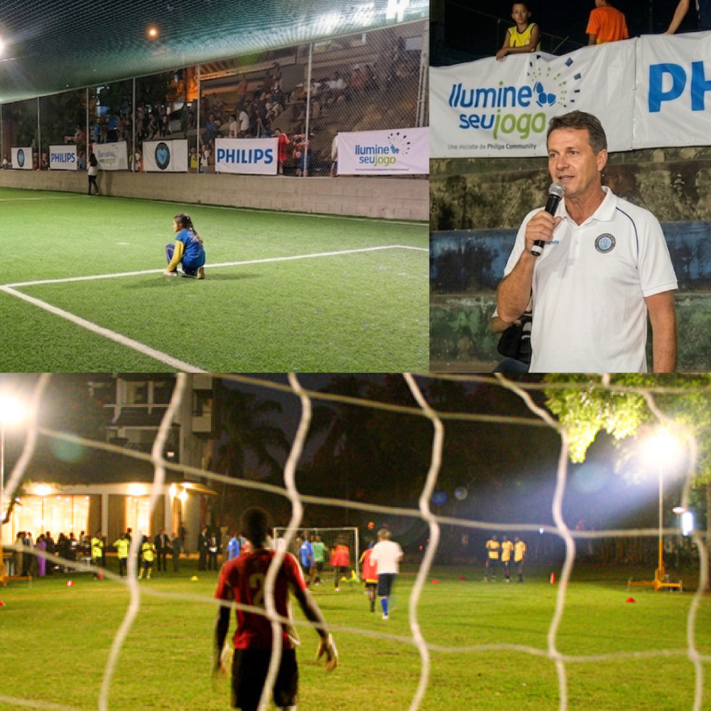
- Event signage
- Banners
- Merchandising
- Local market activations
One of the most strategic elements of the project was the media kit.
Instead of delivering static graphics, we created fully editable infographics, allowing journalists to adapt the information to their own editorial formats while preserving the campaign's message.
The smartest media kit isn't the most polished one. It's the one journalists can actually use.
Results
A Regional Campaign Designed to Scale