

Amadeus

Fertility Center Of Miami
Amadeus
Fertility Center Of Miami
Celistics
Rebranding & Visual Identity
Designing a brand for intelligent logistics
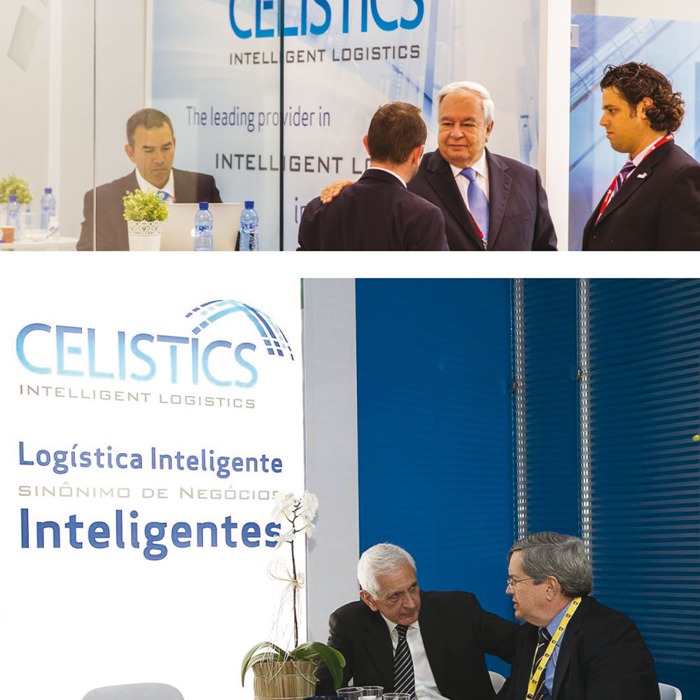
Celistics is a leading provider of intelligent logistics and distribution solutions for the consumer technology industry in Latin America, operating in 16 countries and partnering with major global technology firms.
SRP was entrusted with developing a full rebranding for Celistics, from strategic positioning to visual identity and brand applications. The goal was to capture the essence of Intelligent Logistics: efficiency, innovation, and agility, expressed through a coherent and contemporary design language.
From naming to brand narrative and visual language, our work positioned them as a trusted partner for CPA firms seeking growth and efficiency through accounting and BPO solutions.
The Essence of Intelligent Design
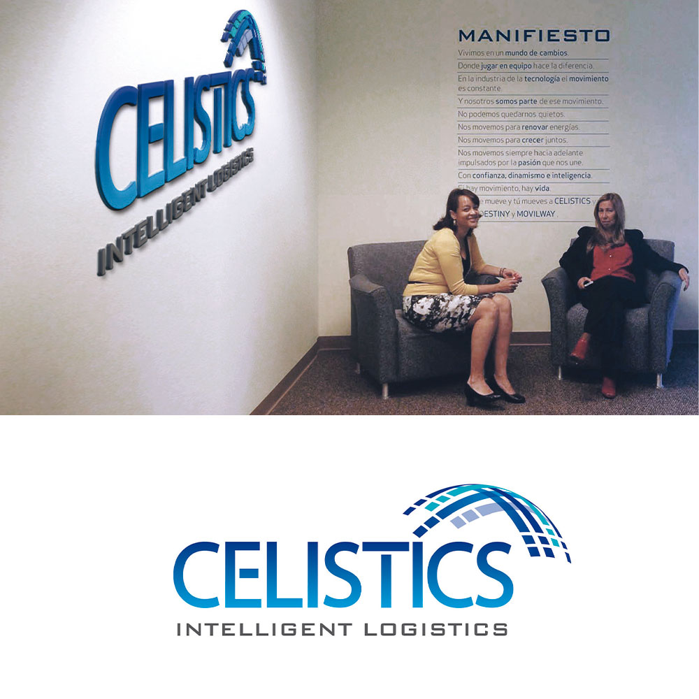
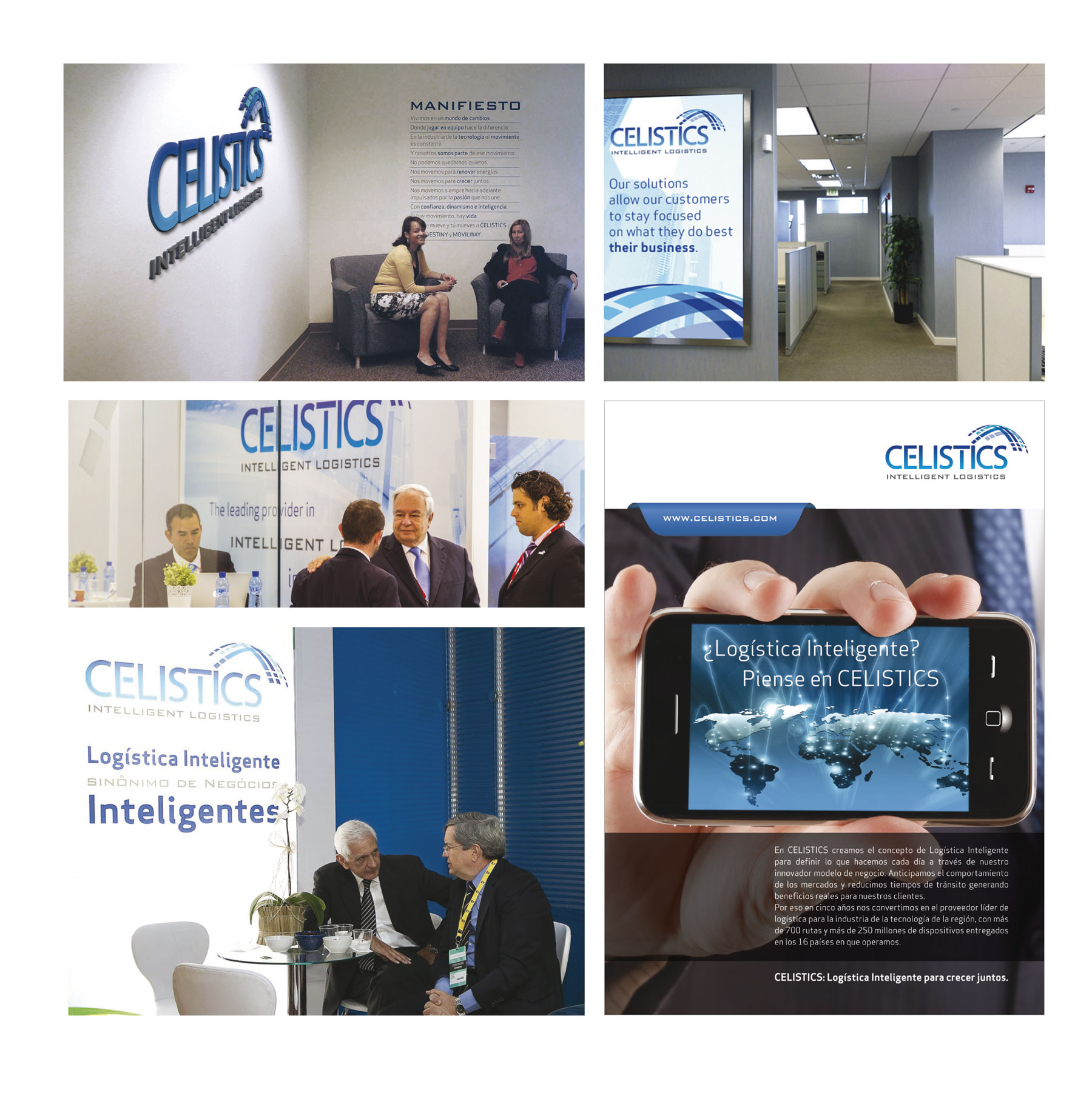
The new logo is a powerful visual statement, deeply connected to Celistics’ core values. Its modern, robust typography grounds the brand name with confidence and precision, while a dynamic palette of blues, shifting from deep to lighter tones, conveys professionalism, technology, and forward motion. This color transition reflects continuous evolution, echoing Celistics’ ability to adapt and innovate in a changing logistics landscape.
At the heart of the identity lies the isotype, a symbol that encapsulates the brand’s vision. Its arched form, built from connected and segmented elements, evokes both the idea of global distribution networks and a seamless flow of technology and information. The structure suggests expansion and reach, a visual metaphor for Celistics’ promise to deliver fully integrated 4PL and end-to-end solutions with intelligence and agility.
The identity also came to life through an animated version of the logo, reinforcing the sense of motion and connectivity that defines the brand’s DNA.
Bringing the Brand to Life
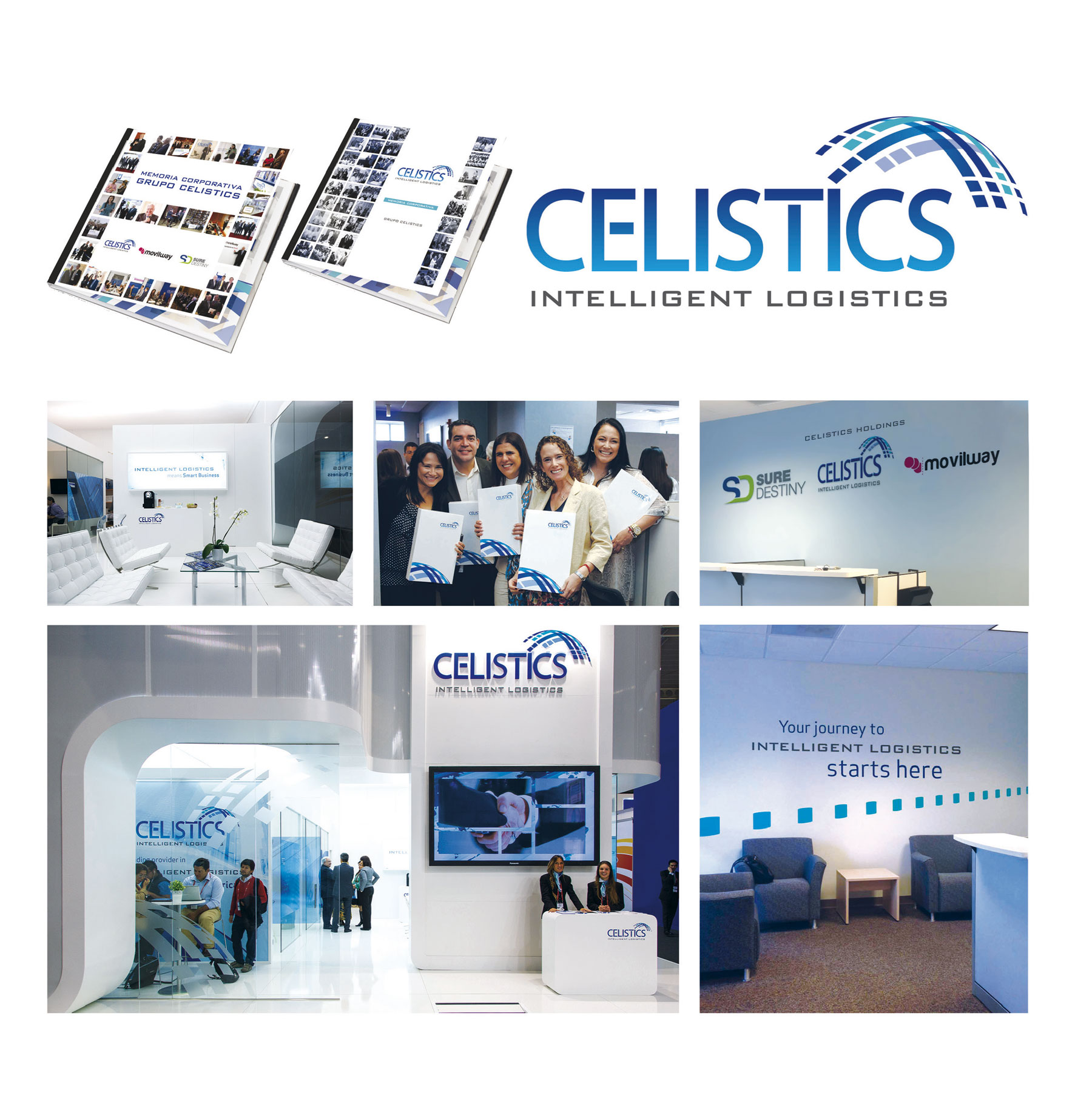
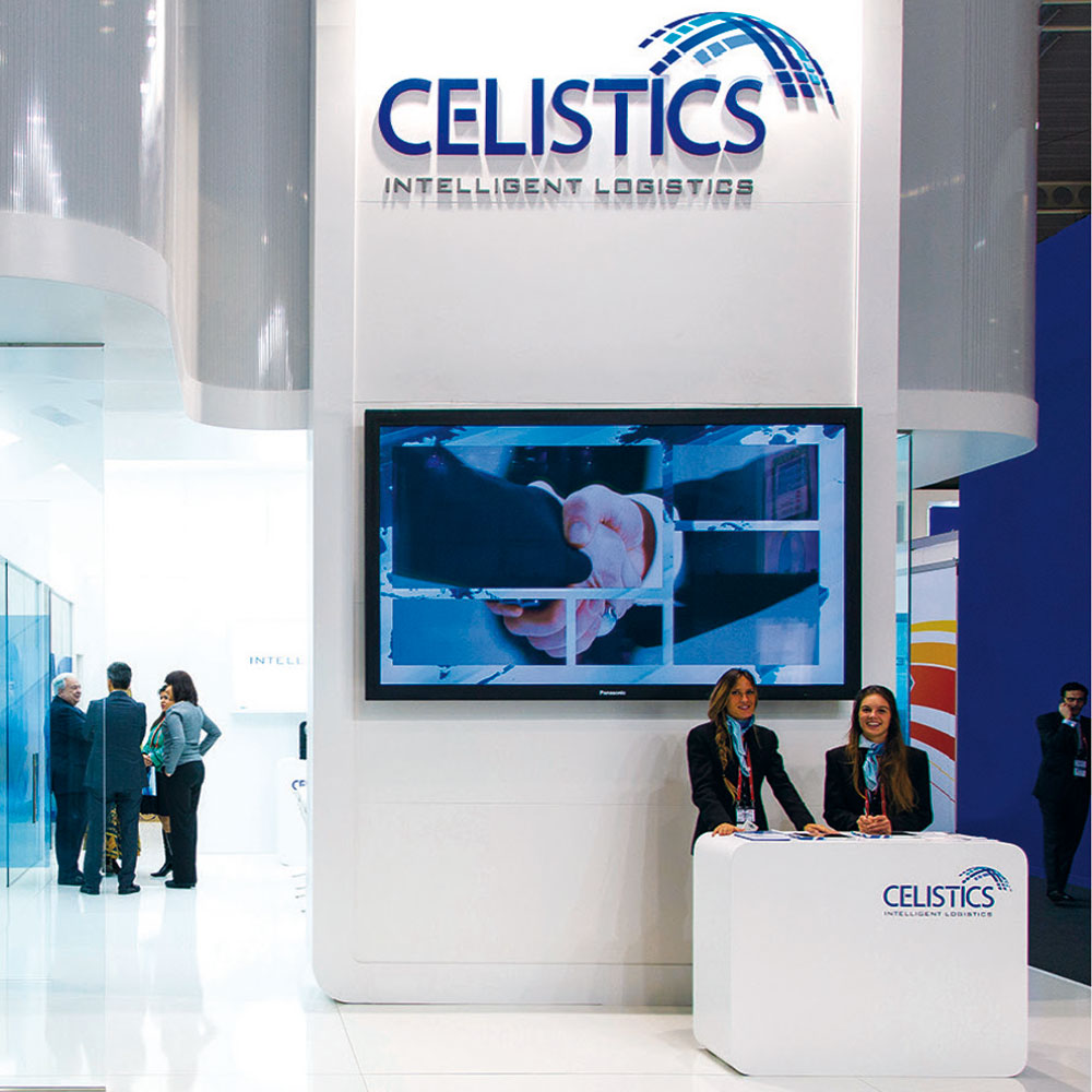
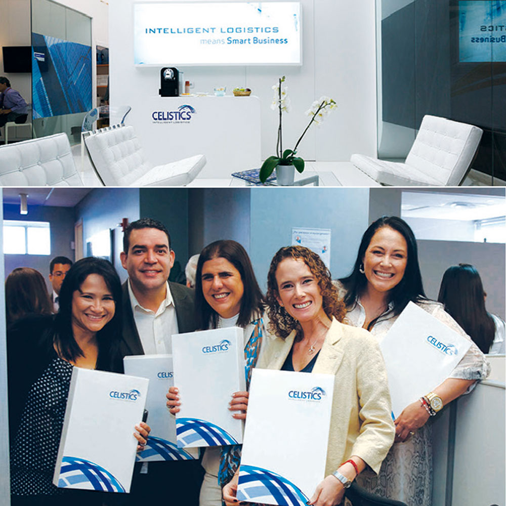
The new identity was implemented across all corporate and environmental applications, ensuring a unified and impactful presence. From business materials and reports to office environments and exhibition spaces, every detail reinforces the sense of precision, scale, and connectivity that defines Celistics.
Special attention was given to office branding, where the brand’s color gradients, graphic system, and iconography were translated into immersive spatial design, turning the workplace into a living expression of the company’s purpose and culture.
The Result
A distinctive, future-forward identity that transformed Celistics’ brand presence and helped position it as a trusted, innovative partner for the technology industry across Latin America.
The brand now visually embodies what it truly stands for: intelligent logistics made visible. Beyond visual impact, the rebranding provided Celistics with a cohesive communication toolkit,uniting tone, messaging, and design across every channel. This consistency not only strengthened internal alignment but also elevated how the company connects with partners and clients throughout the region.