

Celistics

Lutron
Celistics
Lutron
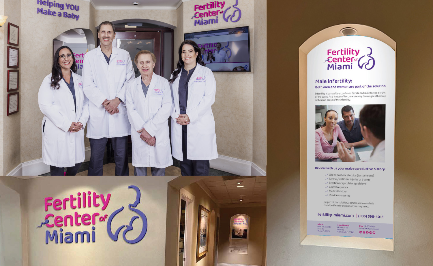
Fertility Center of Miami
Rebranding
Repositioning a Trusted Brand for the Next Generation of Fertility Care
At SRP, we have had the privilege of partnering with the Fertility Center of Miami since the early days of assisted reproduction in South Florida.
When the practice first opened its doors more than three decades ago, Fertility & IVF Center of Miami clearly described what the clinic did. Thirty years later, however, that same name had become a limitation rather than a strategic advantage.
What was once descriptive no longer reflected the practice the Center had become.
The Challenge
A Brand Ready for the Future
The visual identity, typography, and naming convention still reflected a 1990s medical practice, while the Center had evolved into a boutique, patient-centered fertility clinic led by a new generation of physicians.
The challenge went beyond updating the look of the brand.
It required an identity capable of reflecting:
- Advances in reproductive medicine.
- A more compassionate, patient-centered experience.
- An inclusive vision of family.
- For residents earning 60–100% of Area Median Income
- The growing importance of Miami as a destination for fertility care.
A fertility brand that does not reflect who actually walks through the door risks making patients feel unseen.
There was also a strategic opportunity.
The name Fertility & IVF Center of Miami placed too much emphasis on a single procedure, IVF, while the practice had expanded far beyond it. At the same time, it failed to give enough prominence to the word that mattered most for patients and search alike: Miami.
The Solution
More Than a Redesign. A Repositioning.
The project began with one strategic decision: Shortening the name to Fertility Center of Miami.
The new name modernized the brand without sacrificing more than thirty years of trust while placing Miami at the center of the identity, both emotionally and digitally. From there, we rebuilt the visual identity from the ground up.
Our work included:
Brand repositioning
Naming strategy
Custom proprietary typeface
Visual identity system
Refreshed color palette
Brand messaging
Website domain strategy
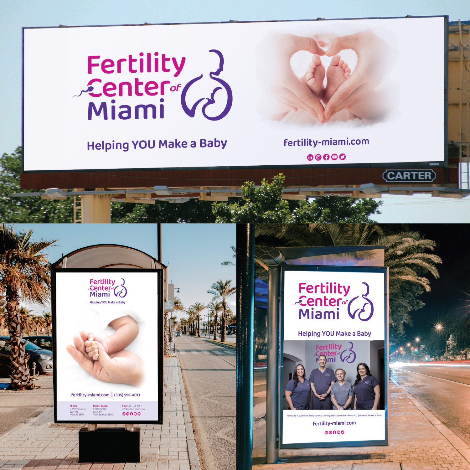
Signage, digital, and social media applications
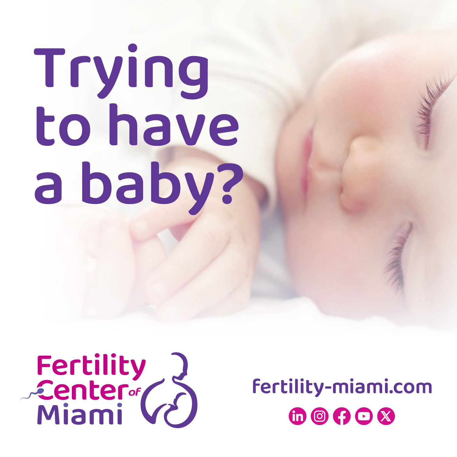
The new symbol was designed to communicate warmth, inclusivity, and care while remaining flexible across every physical and digital touchpoint.
Every campaign, image, and communication piece was rebuilt around a broader definition of family, reflecting the diversity of the patients the Center serves today.
The new slogan,

became the emotional voice of the brand, expressing the Center's mission with warmth, empathy, and a deeply personal tone.
The repositioning also extended to the digital strategy through the adoption of the domain Fertility-Miami.com, strengthening the practice's visibility around one of its most valuable search terms.
Results
A Brand Built for the Next Thirty Years
Today, the new brand extends consistently across:
More importantly, the new identity gives greater visibility to one of the Center's strongest differentiators: Its long-standing commitment to serving intentional families, including same-sex couples, single parents by choice, and patients traveling from across the United States and abroad.
What began as a naming question became a complete repositioning of the brand for the next thirty years. One built to grow alongside the science itself.